The Exposure Velocity Receipt: What GSC Cannot Show Alone
A follow-up AI Symantix lab note showing why Google Search Console impressions become more useful when the Digital Karma Data Warehouse places good-bot hits beside the same query rows.
The Short Version
Google Search Console is still the cleanest place to see search exposure. It tells us which queries are getting impressions, which pages are appearing, and whether clicks have started to follow.
But GSC cannot show the machine layer around those impressions. It cannot tell us whether search engines, AI crawlers, and other good bots are also pressing on the same content. Server logs can show bot activity, but they cannot show query impressions. The receipt only appears when both data sources are merged.
That is why the Digital Karma Data Warehouse matters. It lets us read search exposure and machine activity together, by date, site, page path, and query association.
Why This Is A Receipt
The first Exposure Velocity article described the hypothesis. The first Lab follow-up looked at AI crawler activity and machine-query hits as possible leading indicators.
This follow-up is simpler. It is about the table.
If a query has search impressions and the page paths associated with that query also have good-bot hits in the same date window, the row becomes a machine-discovery receipt.
That does not mean the bot searched the keyword. It means the page carrying that keyword's GSC exposure was also touched by good bots during the same measured period. That is not attribution. It is association. But it is a very useful association.
The July 2026 Snapshot
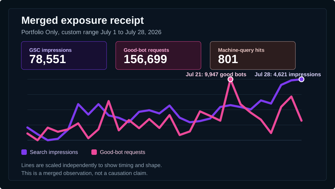
For the Portfolio Only view from July 1 to July 28, 2026, the warehouse showed 78,551 Google Search Console impressions, 156,699 good-bot requests, and 801 machine-query hits. Clicks were only 312, which is exactly why this matters. The exposure layer is much larger than the visible traffic layer.
GSC alone can show that impressions are rising. In this range, impressions moved from 1,977 on July 1 to 4,621 on July 28. But GSC cannot show the pink line beside it. The merged warehouse view can.
What The Pink Line Adds
The pink line gives the search chart machine context. It shows that good bots are not just randomly present somewhere in the server logs. They are active during the same date range where search impressions are being watched.
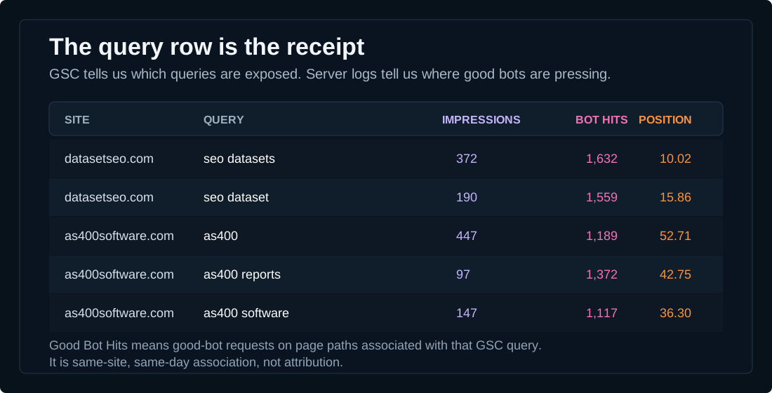
That makes the chart more useful, but the table makes it sharper. The table lets us see which query rows have meaningful impressions and also have good-bot pressure attached to the page paths behind those rows.
What A Query Row Means
The new Good Bot Hits column should be read carefully:
- It is not a count of bots searching that keyword.
- It is not proof that good bots caused the query to gain impressions.
- It is a count of good-bot requests on page paths associated with that GSC query on the same site and day.
That is still powerful. It turns a keyword row into a richer observation. Instead of seeing only impressions, clicks, CTR, and position, we can see whether the same exposed topic is also being touched by machine discovery systems.
Examples From The Warehouse
In the July 1 to July 28 portfolio window, several rows showed the pattern clearly:
- datasetseo.com / seo datasets: 372 impressions, 1,632 Good Bot Hits, average position 10.02.
- datasetseo.com / seo dataset: 190 impressions, 1,559 Good Bot Hits, 16 clicks, average position 15.86.
- as400software.com / as400: 447 impressions, 1,189 Good Bot Hits, average position 52.71.
- as400software.com / as400 reports: 97 impressions, 1,372 Good Bot Hits, average position 42.75.
- as400software.com / as400 software: 147 impressions, 1,117 Good Bot Hits, 15 clicks, average position 36.30.
Those rows do not all mean the same thing. Some are early exposure rows with no clicks yet. Some already have clicks. Some have strong good-bot activity while position is still weak. That is the point. The merged table lets us see which topics may have push before normal SEO reporting would make them obvious.
Exposure Velocity, Not Click Velocity
This is why clicks stay out of Exposure Velocity. Clicks are a discovery outcome. They are important, but they happen later.
Exposure Velocity is about the opportunity to be discovered expanding. Impressions show one part of that. Good-bot activity shows another. Machine-query hits add a narrower clue when they appear, but they are often sparse. Good Bot Hits are more broadly populated, so they give the table a steadier machine-interest signal.
The Better Claim
The weak claim would be: good bots caused these rankings.
The better claim is:
When search impressions and good-bot pressure appear beside the same query-associated page paths, that topic may be entering a wider discovery path before clicks fully arrive.
That is the useful version of the hypothesis. It is measurable. It is cautious. It can be tested again next week, next month, and across more sites in the portfolio.
Why The Merge Is The Product
This signal does not exist inside GSC by itself. It also does not exist inside raw server logs by itself. GSC has the query. Logs have the bot. The warehouse has the join.
That join is what turns a normal SEO report into an AI visibility instrument. It lets us ask a better question: not only "which keywords have impressions?" but "which exposed topics are also receiving machine attention?"
What To Watch Next
- Rows where impressions rise and Good Bot Hits stay high for more than one week.
- Rows where Good Bot Hits rise before impressions move.
- Rows where impressions and Good Bot Hits are high but clicks have not arrived yet.
- Rows where machine-query hits appear on top of already strong good-bot activity.
- Rows that repeat across a topic cluster, not just a single keyword spelling.
That last point matters. A single row is a clue. A cluster is more interesting. If related queries across the same topic all show impressions and good-bot pressure, the topic may have more exposure velocity than any single row suggests.
Bottom Line
The July 2026 warehouse view does not prove causation. It does give us a stronger receipt for the Exposure Velocity hypothesis.
GSC shows the search surface. Server logs show the machine surface. When those two layers are merged, we can see a third thing: query-associated topics where search exposure and machine attention are moving in the same neighborhood. That is exactly the kind of early indicator Exposure Velocity was meant to watch.
Frequently Asked Questions
What is the Exposure Velocity receipt?
It is the merged view where Google Search Console impressions are shown beside good-bot activity and machine-query hits from the Digital Karma Data Warehouse.
Do Good Bot Hits mean bots searched a keyword?
No. Good Bot Hits on a query row mean good-bot requests touched page paths associated with that GSC query on the same site and day.
Does this prove good bots cause impressions?
No. The merged view shows association, not causation. It is useful as a leading-indicator signal to keep testing.
Why can this only be seen in the warehouse?
GSC contains the query and impression data, while server logs contain bot activity. The warehouse can join those layers by site, date, page path, and query association.